Brand Architecture
A precise, geometric identity system designed to reflect clarity, structure, and engineering rigor.
The eigenplus logomark is built on a geometric framework inspired by proportional harmony. Circles and lines are used to define consistent relationships between angles, lengths, and spacing.
This system ensures the mark remains visually balanced at every scale, from small icons to large-format applications.
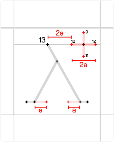
Construction process
The logomark is constructed through a sequence of precise steps. Each step builds upon the previous one, maintaining proportional consistency throughout.
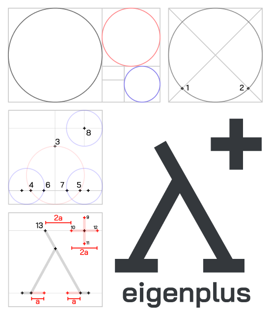
Base geometry
The foundation of the logomark begins with a circular grid that establishes the primary proportions.
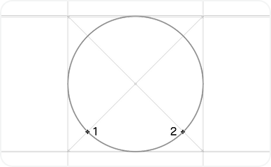
Structural form
Key line segments are introduced to define the angular structure. These angles stay consistent across all variations.
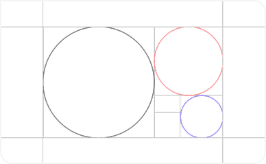
Logomark formation
The abstract form is refined into the final eigenplus symbol by aligning intersections and removing excess geometry.
Refinement
Minor optical adjustments are applied to ensure visual consistency, especially at smaller sizes.
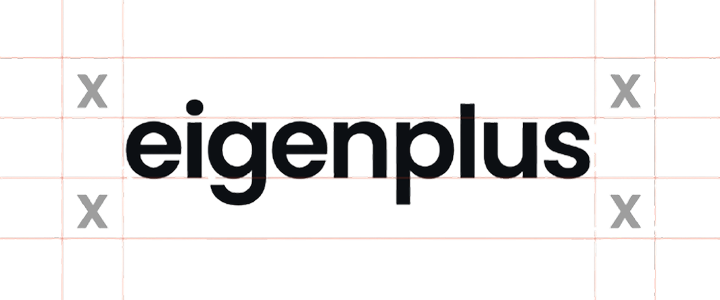
Clear space and alignment
To preserve legibility and visual impact, the eigenplus logomark must always be surrounded by adequate clear space.
The minimum clear space is defined by the height of the logomark's primary stroke. No other visual elements should enter this area.
Typography system
Primary typeface
Poppins
Used for the eigenplus wordmark and key brand expressions. Its geometric structure complements the precision of the logomark.
Secondary typefaces
Inter for interfaces and functional UI text
Merriweather for long-form reading and editorial content
Type settings
- Tracking: -4% (-0.3px)
- Line height: 24px (for standard body size)
- Consistent optical alignment applied across headings
Design rationale
The combination balances clarity, readability, and warmth while aligning technical precision with approachability.